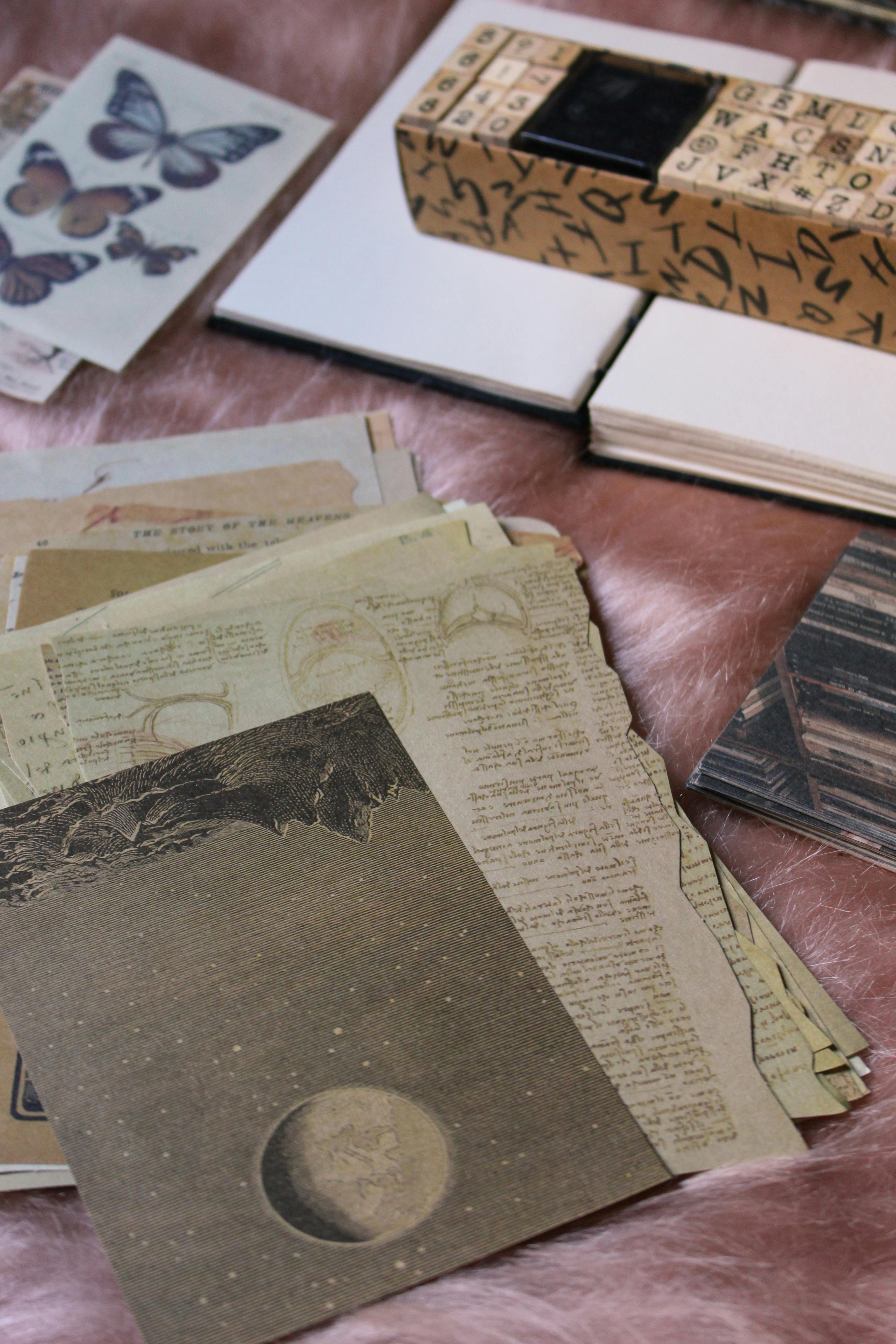
Vintage scrapbook paper has enormous charm, but it also has a habit of intimidating people. Old-book prints, ledger lines, tea-stained neutrals, faded florals, ticket motifs, and worn typography can look beautiful in a paper pack and then suddenly feel heavy once they sit under real photographs. Instead of supporting the story, the page starts competing with it.
The problem is rarely that vintage paper is too decorative. More often, it is that the paper is being used at full intensity in every layer at once. When everything looks aged, distressed, patterned, and meaningful, nothing has room to breathe. Good vintage-style pages still need hierarchy, contrast, and calm.
This guide focuses on exactly that balance. We will look at what makes scrapbook paper feel vintage, how to pair it with photographs without muddying them, and how to use aged patterns in a way that feels warm, collected, and intentional rather than cluttered.
What makes scrapbook paper look vintage
Vintage scrapbook paper usually borrows from older printed materials and weathered surfaces. Common visual cues include faded handwriting, ledgers, postal marks, botanical illustrations, sepia tones, soft damasks, worn edges, old maps, tickets, and muted florals. The palette often leans warm: cream, tan, tobacco, dusty rose, sage, faded navy, and softened black.
That does not mean all vintage paper is brown. Some collections use pale blues, chalky greens, soft burgundy, or antique gold very effectively. What matters more than the exact colour is the sense of age and patina. The patterns look lived-in rather than crisp and modern.
If you are still building your paper stash, our broader guide to choosing scrapbook paper is a useful place to start. It helps you think about weight, finish, and how patterned papers behave before you narrow into a more specific style lane like vintage.
Where vintage scrapbook paper works especially well
People often associate vintage paper only with heritage albums, but that is much too narrow. It certainly works beautifully for older family photographs and memory-rich keepsakes, yet it also suits wedding albums, travel pages, literary themes, seasonal projects, recipe books, and quieter everyday family stories.
Vintage paper tends to work best when the page carries emotion, history, texture, or story depth. It is especially useful when you want the page to feel layered and reflective rather than bright and playful. For present-day family stories, it can make ordinary routines feel grounded and timeless instead of overly trendy.
If your project is more explicitly heritage-led, pair this style with our family history scrapbooking guide. That article covers the story and preservation side, while this one stays focused on paper selection and visual behaviour.
Use one strong vintage layer, not five competing ones
The quickest way to overwhelm a page is to use several busy vintage papers together without enough plain space between them. Because these patterns already contain so much visual texture, the page usually benefits from one dominant vintage sheet and one or two quieter supporting pieces.
For example, you might choose an old-ledger print as the background, then add plain cardstock mats and one softer floral or map strip as an accent. Or you might keep the background neutral and use one richly distressed paper only behind the photo cluster. Either approach gives the eye a place to rest.
This is also where colour theory for scrapbooking becomes unexpectedly useful. Vintage papers often contain several low-contrast tones at once. A little conscious contrast planning keeps the page from collapsing into one soft blur.
How to keep photographs clear against aged patterns
Vintage designs can swallow photographs if the tones are too similar. Black and white images, sepia prints, and indoor family snapshots are especially vulnerable because they already carry lower contrast. The fix is usually simple: give the photo a clean mat or a more solid block behind it.
- Use cardstock mats: Cream, charcoal, deep olive, faded navy, and muted burgundy often separate photographs from patterned backgrounds well.
- Limit strong text under faces: Ledger lines and handwriting look charming until they run directly behind eyes and expressions.
- Keep the busiest paper away from the focal image: Place it at the edges, in layers, or as a side panel instead.
- Print slightly brighter if needed: Dark, low-contrast photos can disappear on antique-looking papers unless they are corrected first.
If your images are being prepared digitally before printing, this pairs naturally with our guide on where to print 12x12 scrapbook pages, especially for hybrid projects where paper choice and photo output need to work together.
Background paper, accent paper, or matting paper?
Vintage scrapbook paper can play three different roles, and the role changes how bold you should be.
- Background role: Choose softer, more open patterns such as faded ledgers, lightly mottled creams, or subtle botanical washes.
- Accent role: Use bolder map pieces, script fragments, stamps, or postcard motifs in controlled amounts.
- Matting role: Pick quieter distressed solids or lightly textured prints that add age without shouting over the photo.
Most pages only need one of those roles to be visually loud. When every layer is bold, the page starts to look costume-like rather than collected.
"Vintage style works best when it feels gathered over time, not applied all at once."
Vintage paper is not the same thing as ephemera
This distinction matters because the two are often used together. Vintage paper gives you the background mood and colour story. Ephemera gives you the small storytelling pieces: tickets, labels, torn notes, postcards, tags, die cuts, and overlays. They complement each other, but they are not interchangeable.
If you want a fuller discussion of those smaller layered extras, move next to our guide on using ephemera in scrapbooking. That article covers the keepsake and embellishment side. This page is deliberately narrower, focusing on the paper foundation itself so the two topics do not blur together.
Best projects for vintage scrapbook paper
- Family history pages: Heritage photographs, handwritten recipes, old letters, and ancestry stories.
- Travel albums: Maps, tickets, museum visits, older city centres, and train journeys.
- Wedding and anniversary pages: Soft florals, linen textures, and restrained antique tones suit romantic storytelling well.
- Bookish or academic themes: Library days, school milestones, reading journals, and literary gifts.
- Autumn and reflective seasonal pages: Warm neutrals and aged textures often sit comfortably with fall colour palettes.
Common mistakes with vintage paper
- Too many distressed edges: One worn edge can feel authentic. Six on one page usually feel staged.
- No clean contrast: Vintage papers still need plainer cardstock and breathing room to work properly.
- Using dark papers behind dark photos: The mood becomes muddy instead of rich.
- Turning every embellishment vintage too: Let some elements stay simple so the page does not become visually noisy.
- Assuming vintage means old photos only: Modern pictures can look wonderful against aged papers when the palette is balanced well.
A simple formula that usually works
If you want a safe starting point, try this: one soft vintage background, one darker mat behind the main photo, one small cluster of ephemera, one strip of contrasting cardstock, and a clear journaling block. That formula gives you the romance of the style without asking the page to carry too many competing textures at once.
Once that feels comfortable, you can layer more boldly. The important thing is building from readability first, then adding atmosphere second.